Print Design Work
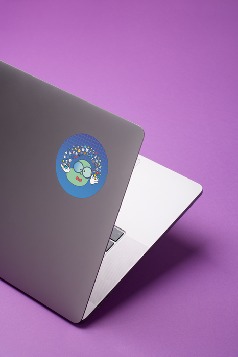
Vinyl signs, stickers, t-shirts, beer bottles, book covers for digital & print. Designs that need to look just right.

The Power Of P.R.E.S.E.N.C.E Book Cover
Collaborated closely with the author Tessie Watts to bring The Power of P.R.E.S.E.N.C.E. to life, guiding the visual direction through three distinct design iterations. We landed on a clean, powerful cover that balanced warmth and authority, featuring custom illustration and a restrained color palette. I handled everything from initial concept to print-ready delivery, aligning the spine, setting up proper bleed, and formatting the final files to meet KDP's technical standards without sacrificing visual integrity.
A great read, I definitely recommend Tessie Watt's work!
Tools Used: Adobe Photoshop · Adobe Illustrator · Adobe InDesign · KDP Print Previewer · Amazon KDP Cover Calculator · Canva (for collaborative feedback or mockups)
This project began when author and leadership expert Tessie Watts reached out after having a cover designed on Fiverr. While she liked the overall vibe of the initial concept, she was looking for a more collaborative, back-and-forth process with a designer who could help refine the idea into something more polished, intentional, and aligned with her brand.
Since her company, The Leadership Haven, already had an established teal brand color, I began by building a cohesive palette around that hue. I then reviewed what worked about the Fiverr version and noted areas that felt too clinical or unpolished.
From there, I explored several visual directions centered around the theme of “presence” in leadership. I was especially drawn to the symbolism of earning a seat at the table- a concept familiar to anyone who's ever sat through a leadership workshop. I developed five initial concepts featuring an office chair as a central, welcoming focal point, enhanced with a glowing, energetic aura to evoke confidence/belonging rather than intimidation.
Once we landed on a direction that resonated, I refined the illustration, typography, background, and lighting, and collaborated with Tessie on details like her portrait placement and how it would integrate into the scene. The final design stayed true to her brand while presenting a more professional, engaging, and production-ready cover- delivered to exact print specs for KDP.
Drafts & Scrapped Concepts

TPOP Leadership Journal Book Cover
The journal was a later-phase addition designed to complement the original book while feeling like its own experience. It needed to feel cohesive yet clearly read as a journal, something inviting, reflective, and feminine but still strong. I reinterpreted the core design elements from the book to create a softer, more spacious layout, adjusted typography for note-taking and prompts, and built the file for seamless KDP compatibility.
A must-have addition if you buy the book!
Tools Used: Adobe Photoshop · Adobe Illustrator · Adobe InDesign · KDP Print Previewer · Amazon KDP Cover Calculator · Canva (for collaborative feedback or mockups)
For the companion journal, there wasn’t an existing cover concept to build from, but Tessie shared excerpts from the inside pages, which were full of hand-drawn doodles, playful fonts, and a much more personal, expressive tone than the main book. I started by reading through the content to get a feel for the journal’s voice and personality, which helped guide the visual direction.
The goal was to create something that clearly felt like a sibling to the original book, while still having its own identity. I reimagined the clean, structured book design into something softer and more handcrafted.
Instead of the crisp geometric gradient from the cover, I painted a similar effect using watercolor textures in Photoshop to create a more inviting vibe. I also illustrated a hand-drawn version of the signature chair from the book, giving it a sketchier, more organic look to match the journal’s internal artwork.
To keep things cohesive, I carried over a few of the book’s key typefaces and mixed in some more expressive fonts to reflect the journal’s creative and introspective tone. The final design feels warm, approachable, and aligned with the prompts inside. It invites readers to slow down, reflect, and really make the journal their own.
_edited.png)


